Efficiency and waste reduction are pivotal in streamlining business operations for optimal performance and profitability. At the heart of these improvements is process optimization, a journey that requires powerful tools and analytical approaches. One such powerful tool is a Pareto Chart. In this article, we delve into how to utilize the Pareto Chart to maximize efficiency and minimize waste, thus driving your business to new heights.
Table of Contents
Utilizing Pareto Charts
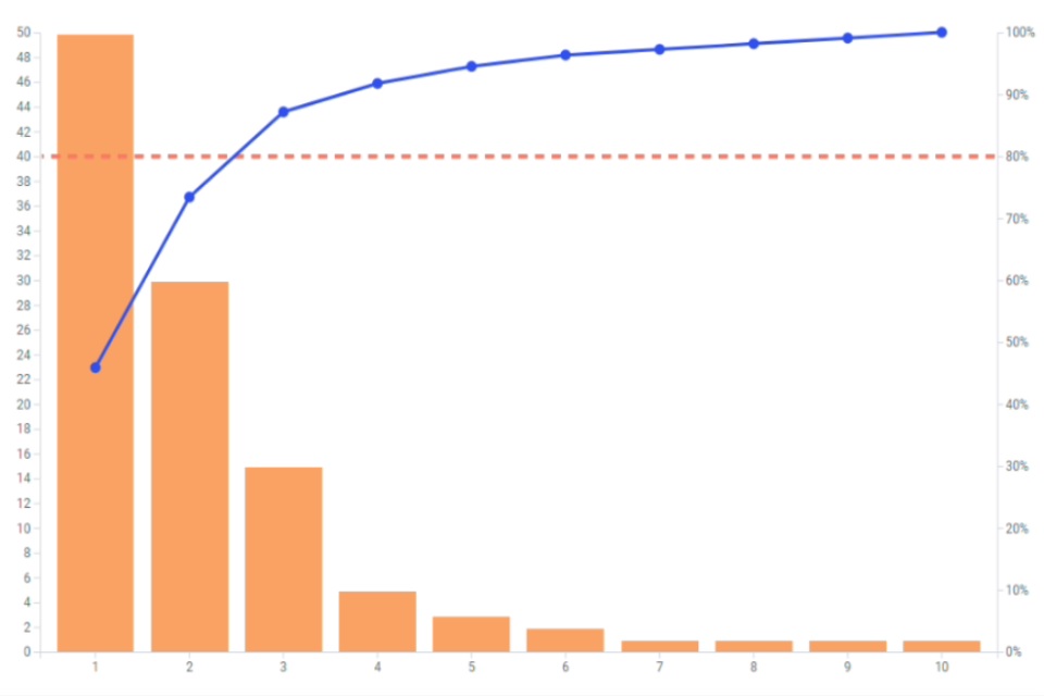
Alt Text: An image depicting an example of a Pareto chart
The Pareto Principle, also known as the 80/20 rule, posits that roughly 80% of outcomes result from 20% of causes. Understanding this principle and how it applies to your business operations is the first step toward process improvement.
Charting this principle through Pareto Charts offers a visual tool that powerfully illustrates this vital statistical truth within your processes. This easy-to-understand presentation can drastically enhance your comprehension of aspects impacting efficiency.
Pareto Charts are powerful tools for data-informed decision-making. Pareto Charts can help point out the ‘greatest hitters’ in your processes, shedding light on where to channel your resources for the highest return. By focusing on these high-impact areas, businesses can improve their efficiency exponentially.
Furthermore, Pareto Charts can help eliminate inefficiencies by highlighting the ‘lower 80%’ – areas demanding a large portion of resources yet yielding minimal returns. By addressing these, firms can streamline operations, eliminate waste, and enhance overall efficiency.
Understanding The Basics Of Pareto Charts
A Pareto Chart is a type of bar chart that displays problem areas in descending order of frequency, with a separate line representing the cumulative percentage of these problems. The left vertical axis has the frequency of occurrence, while the right vertical axis represents the cumulative percentage of the total number of occurrences.
The primary goal of a Pareto Chart is to highlight the most significant factors in a dataset. In essence, it’s a visual demonstration of the Pareto principle, further endorsing the idea that the majority of problems are produced by a small number of causes.
Thus, by isolating and addressing these ‘few’ causes, you can drastically improve the overall process. Understanding this basic concept can greatly assist you in your journey toward efficiency and waste reduction.
Recognizing these basics and the rationale behind Pareto Charts makes it easier for a team to implement them effectively. Furthermore, integrating Pareto analyses into continuous improvement efforts will help maintain momentum and foster a culture of ongoing improvement.
Strategies For Maximizing Efficiency Using Pareto Charts

While the primary step in utilizing Pareto Charts is identifying critical problems, effective use of these charts extends beyond this. For each identified issue, it’s crucial to understand the underlying root causes, which can be established via comprehensive data analysis and problem-solving methodologies.
Coupling Pareto Charts with other quality tools, such as fishbone diagrams, can aid in root cause analysis. The identified root causes can then be tackled to improve the quality of the process and enhance efficiency.
Another strategy involves constant monitoring and updating of the Pareto Charts as improvements are made. This not only demonstrates the effectiveness of your efforts but also reveals other potential areas of focus that may have been masked by more dominant issues previously.
Lastly, remember that Pareto Charts should not be utilized in a vacuum. They work best when integrated with other process improvement tools as part of a holistic approach to quality management.
Applying Pareto Charts To Identify & Reduce Waste
Pareto Charts can be instrumental in waste reduction by identifying non-value-adding activities within your process. These are the tasks that do not contribute to the end product’s quality or the customer’s needs but, indeed, consume resources.
By creating a Pareto Chart of these wasteful activities, you can visualize their impact on your operations and make data-driven decisions on waste reduction strategies.
Targeting the ‘vital few’ waste areas and eliminating them has the potential to deliver substantial cost savings and significantly enhance operational efficiency. Moreover, the continuous monitoring and updating of the Pareto Chart ensures that waste reduction is not a one-time event but an ongoing process of continuous improvement.
Altogether, Pareto Charts are compelling data visualization tools to guide efficiency and waste reduction efforts. They assist businesses in prioritizing their resources and efforts, and when implemented correctly, the results can be transformative for operations and overall performance. It is, however, important to remember that their effective use entails a comprehensive understanding of the process and the integration of the Pareto analyses within an overall quality management strategy.